Thursday, 15 April 2010
Final Book - My Thoughts
I have chosen to upload only half of the pages onto this blog. The rest can be viewed in the book itself. I may choose to re-scan the pages at some point and pay for a reprinted copy done through blurb.com as the original is quite fragile and won't stand up to too much wear and tear.


Further Sketchbook/ Developmental work

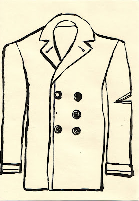
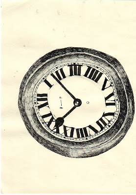
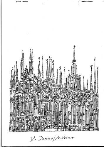
Because of the nature of my final outcome; most of the research and development for images had to happen as i was creating them. I would initially think of a concept, then begin image generation, often making use of the metaphors already present in the text and in some cases elaborating upon these, experimenting with medium and form until i reached a conclusion i was happy with and then i would move on to the next image. Because of this all the images could be argued to lack the sort of cohesion they would have had, had they been finalized using the same style of drawing, but they nonetheless work as a whole.

Sketchbook developmental work/ Research 2


 I began drawing the finals in this very meticulous way using pen and ink but the results for me were too static and fusty, after group presentations I agreed to re-work my images in a way that made them more similar stylistically.
 an alternative colourway for one of the lino-cut prints.
Sketchbook developmental work/ Research

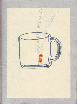
 This cigarette box illustration was inspired by Gordon's ability to see something negative in all advertisement. There are a number of moments in the book where he is concerned by his lack of tobacco but the most interesting to me is in the opening chapter where he is fiddling with the packaging of his Players cigarettes and fretting about his lack of money.
 Pretty well all of these Images have been explained in my final book and are just examples of the visuals at various developmental stages.
Book Binding
I began experimenting with binding a small hardback sketchbook before starting on my final book. Like with old photo albums i chose to have the marbled sheets on the immediate inside cover.

 The marbling Inks needed proved difficult to get hold of and so instead i ground up some old 1970's oil pastels and dissolved them in some turpentine to serve as a substitute, the results were good although even when dry the colours were prone to smudging.

I did, at first, try to make my own homemade paper; pulping waste and sieving it using an old silk-screen but the results were too thick and uneven for my purposes so i abandoned it and chose to buy sheets of recycled paper instead to serve as the pages of my scrapbook. Although my book is far from perfect i feel like i have learned sufficient that should I wish to do it again the results would be up to a higher professional standard.

The marbling Inks needed proved difficult to get hold of and so instead i ground up some old 1970's oil pastels and dissolved them in some turpentine to serve as a substitute, the results were good although even when dry the colours were prone to smudging.I did, at first, try to make my own homemade paper; pulping waste and sieving it using an old silk-screen but the results were too thick and uneven for my purposes so i abandoned it and chose to buy sheets of recycled paper instead to serve as the pages of my scrapbook. Although my book is far from perfect i feel like i have learned sufficient that should I wish to do it again the results would be up to a higher professional standard.
Presentation
Having been fairly critisized in the past for my lack of attention the presentation of my drawings, I would like for this project, to present my collected works together in a hand-bound book. Both the quintessentially English pastimes of scrapbooking and paper-marbling were very popular in the Victorian era (up until 1910) and quite possibly afterwards. I would like to combine all these aforementioned elements to present my work in a way that is appropriate and fitting with the images themselves.
Examples below of a Victorian scrapbook and paper marbling:


Examples below of a Victorian scrapbook and paper marbling:
Artists
 Alan Fletcher
 Randall Enos
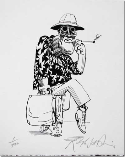 Ralph Steadman
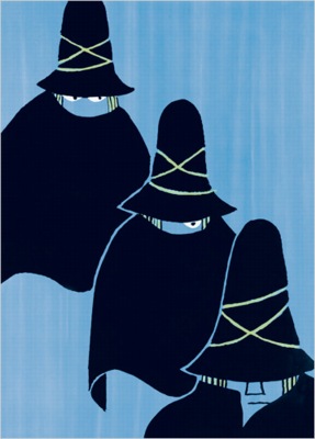 Tomi Ungerer
In an attempt to explain some of my inspirations for the aesthetic aspect of my work in this project I have selected some of my favorite images from my favorite artists. I want, like these images, the body of work i create to reflect a capable eye for design as well as ability as far as drawing and printmaking are concerned.
Printmaking and Books
It seems only fitting that at least some of the project be dedicated to printmaking as most books from the mid-1930s would still have been illustrated using traditional printing techniques; making it the most appropriate choice when visually describing concepts and ideas from that era. Also the fact that for the last two projects it was my chosen focus with regards to medium should be taken into account, especially when it is a subject i would like to pursue once the course has come to its conclusion. David Jones is a good example of an illustrator/printmaker working in the 1930's who has been an inspiration to me.
 http://www.flashpointmag.com/jonestownchild.htm
http://www.flashpointmag.com/jonestownchild.htm
Books
For the extended major project i have decided to construct my body of work from the novel Keep the Aspidistra Flying by George Orwell, this choice makes sense when taking into account the subject material for my previous two projects. I feel like I have found a comfortable method of working when working from a text so a publishing brief seems most appropriate. As well as reading the book itself in its entirety during the course of the project, there were a number of other books mentioned within the book, which i attempted to source and then read; so that i might develop a better understanding of some of the concepts. Both Aldous Huxley's Brave New World and the Sherlock Holmes stories by Sir Arthur Conan Doyle have direct mention in the text both of which helped me to understand some of the protagonists literary background. Sourcing the books from amazon.co.uk has also enabled me to begin collecting classic paperbacks like the ones displayed in the book '700 Penguins' mentioned in my previous project, I have found as much inspiration from their design and presentation as in the work of my favorite illustrators.
Also displayed below is an example double spread from a 1949 paperback copy of Pygmalion by Bernard Shaw which I was surprised to find Illustrated. The potential for producing illustrations that might be appropriate accompanying the entirety of an adult-themed book first struck me when i saw this.


Also displayed below is an example double spread from a 1949 paperback copy of Pygmalion by Bernard Shaw which I was surprised to find Illustrated. The potential for producing illustrations that might be appropriate accompanying the entirety of an adult-themed book first struck me when i saw this.
Berlin Study Trip


The study trip to Berlin provided me with the opportunity to gather inspiration by exploring a new city, making recordings and visiting exhibitions. Amongst many other things we visited Quasimodo jazz bar, viewed a George Grosz exhibition and trawled around the enormous Hamburger Bahnhoff art museum. All in all a healthy dose of culture.
(Photos taken using Kodak Cresta and out of date Fujicolor pro 400H)
Subscribe to:
Comments (Atom)